-
Architects: Best Practice Architecture
- Area: 1000 ft²
- Year: 2015
-
Photographs:Rafael Soldi

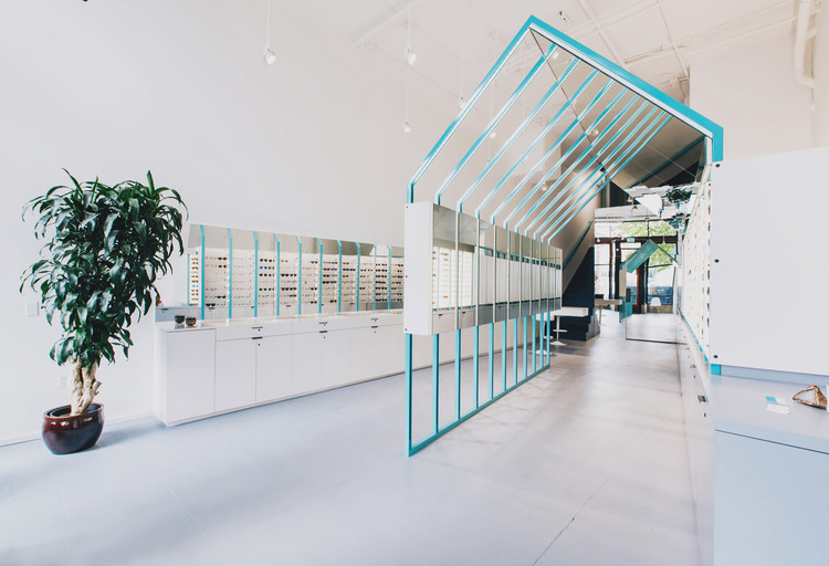
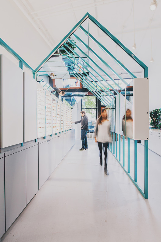
Text description provided by the architects. Making its home in an existing brick building in Seattle’s bustling Capitol Hill neighborhood, Eye Eye seeks to playfully reflect the image of the street and that of the patron trying on eyewear. Best Practice Architecture deliberately aimed to toy with perception and reflection as you move through the space, giving the visitor multiple viewpoints simultaneously.

The narrow interior volume (North facing) was painted white, creating a neutral, double height volume in which to layout the Clinic Rooms, consisting of an exam room, restroom and office, as well as the retail/sales area. Clinic functions in need of privacy and quiet were grouped to the rear behind a mirrored wall and on a small mezzanine level, while the retail and sales zone could be street facing.

The concept evolved to incorporate a series of powder-coated steel “house” frames which march rhythmically through the space. Clad with a mixture of custom acrylic & wood eyeglass display boxes and mirrored surfaces, the frames have integral lighting which allow the viewer to try on eyewear and see themselves from many angles concurrently in their own private viewing gallery.

This iconic house also directs the visitor toward the rear LENS, or mirrored wall that functions much like the lens of your eye (refracting light and focusing it on the retina), and leads to the exam room. One enters the exam room through the pivoting mirrored door, and is greeted with a warm and inviting space clad with white oak cabinets.

Intended to be a relief from the more minimal retail zone, the cozy exam room contains a mixture of new and colorful, vintage optometry equipment and has space for several different types of testing.


